We’re big fans of a bold color moment. The right moody tone can completely shift the feel of a room—it adds depth, character, and something just a little unexpected.
And when we use moody colors in our projects, we don’t stop at one wall. We like to go all in—walls, ceiling, trim—because that full-on commitment is where the magic happens. These colors aren’t meant to be subtle. They’re meant to set a mood.
Most of our clients lean toward soft whites and neutrals for their main spaces (and we love those too). But when the opportunity comes to do something bolder—like a guest room, home office, powder bath, or lounge—we’ll often recommend one of our tried-and-true moody shades. We think of them as jewel box rooms—small spaces that make a big impact.
Here are a few of our go-to moody tones—the ones we reach for again and again because they just work.
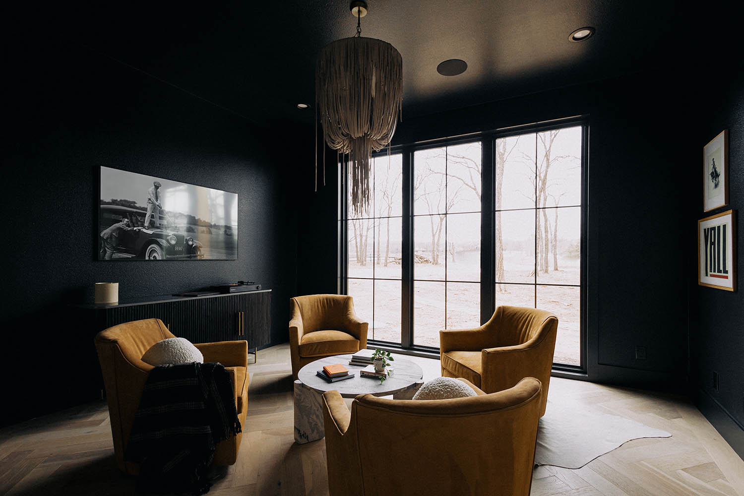
Greenblack – Sherwin Williams
Used in: lounge, home office, speakeasy
Dark, dramatic, and full of personality. Greenblack reads as nearly black, but with a subtle green undertone that gives it warmth and complexity. It’s a favorite for intimate, tucked-away spaces that should feel a little bit moody and a lot intentional.
Iron Ore – Sherwin Williams
Used in: home office
A soft charcoal that brings instant focus to a space. We love this for offices, dens, or areas where you want to feel grounded but not closed in. It pairs beautifully with oak, aged brass, and lighter textiles.
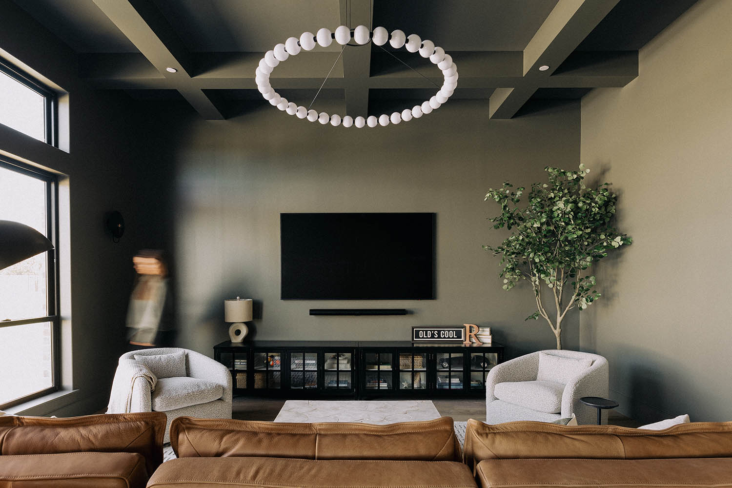
Thunderous – Sherwin Williams
Used in: game room
This deep, earthy green-gray adds quiet drama without feeling trendy. We used it in a game room where we wanted the space to feel comfortable, casual, and still elevated. It works great with leather, natural textures, and a relaxed, layered palette.
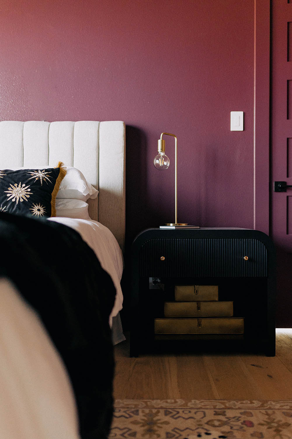
Merlot – Custom Blend
Used in: guest bedroom
We went deep and bold with this one—and the result was worth it. Merlot is a rich, wine-inspired tone that adds warmth and dimension to guest spaces. Paired with simple linens and soft lighting, it creates a boutique hotel vibe that feels elevated but still cozy.
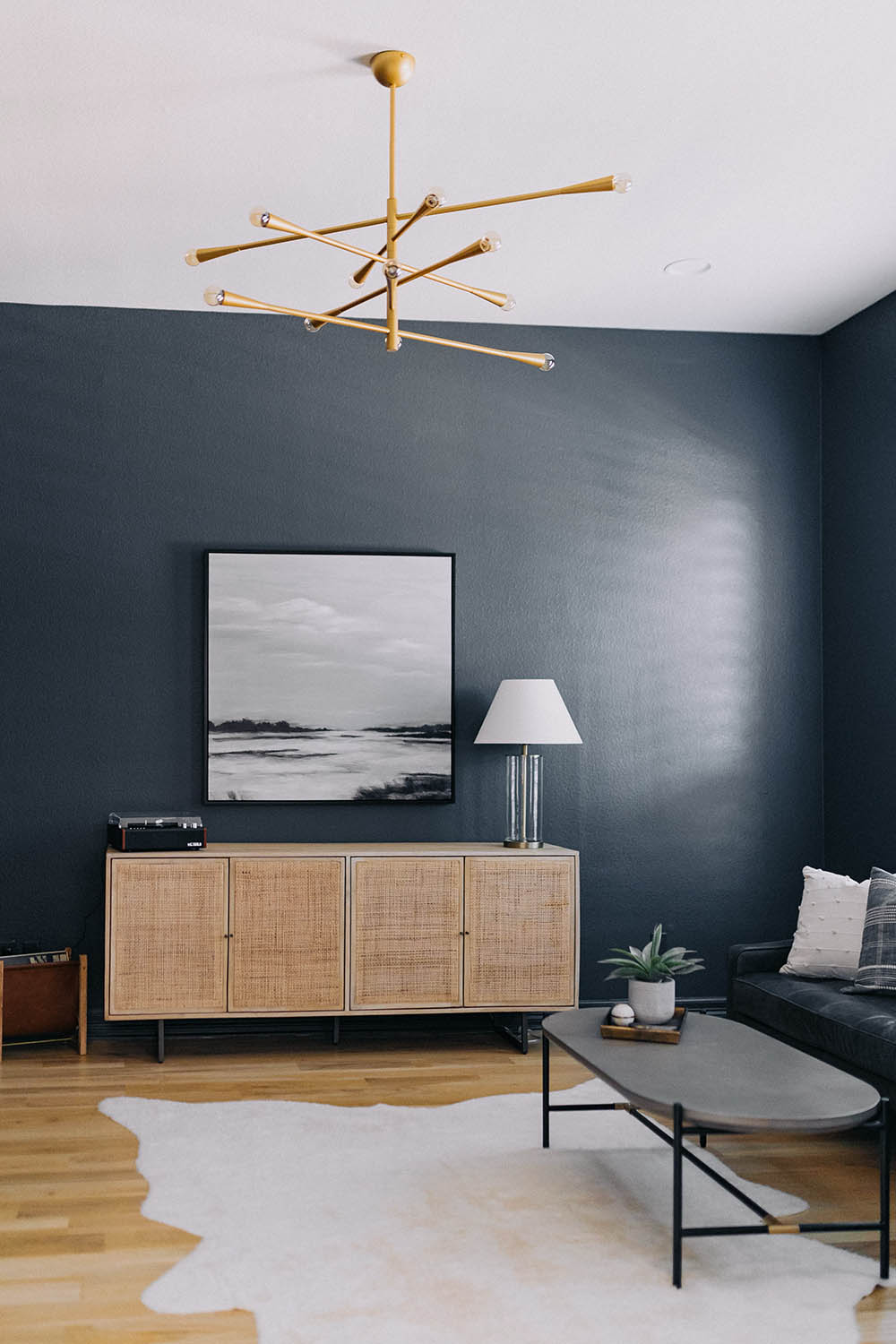
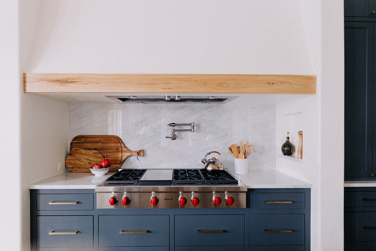
Down Pipe – Farrow & Ball
Used in: kitchen cabinetry, home office
This one’s a classic—deep, stormy, and endlessly versatile. We’ve used Down Pipe in both kitchens and offices, and it adds that just-right edge. It pairs beautifully with natural stone, white oak, or warm metal finishes.
Why We Love These Colors
Moody tones are more than just “dark paint.” They create contrast, define a space, and offer a completely different experience within the home—especially when the rest of the palette stays soft and neutral.
We use these colors to elevate the architecture, highlight natural materials, and create moments of calm, focus, or surprise. And when used intentionally, they can feel timeless and grounded, not trendy or overpowering.
Helping You Pick the Right One
We help our clients choose moody colors that are right for them—taking into account the space, lighting, finishes, and overall feeling they want the room to have. It’s not about picking the boldest option—it’s about choosing the one that brings everything together.
Whether we’re designing a home office, a tucked-away lounge, or a guest bedroom that makes people say “wow,” we love guiding our clients toward bold choices that feel totally personal and perfectly placed.
A Few Favorite Moody Moments
- Speakeasy | Greenblack, Sherwin Williams
- Office | Iron Ore, Sherwin Williams
- Game Room | Thunderous, Sherwin Williams
- Guest Room | Merlot (custom blend)
- Kitchen Cabinetry | Down Pipe, Farrow & Ball